Brand Identity - Selected Works
Logo Design
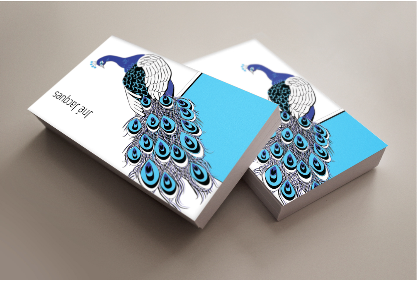
B&G Peacock Logo
The B&G Peacock logo was developed as a foundational identity system, using an illustrative peacock motif structured for clarity, repetition, and scalability across print formats. Applied to business card design, the mark balances ornamental detail with controlled color contrast and negative space, reflecting an early emphasis on brand systems that translate reliably into physical production.
Brand Identity - Selected Works
Brand Applications - Digital
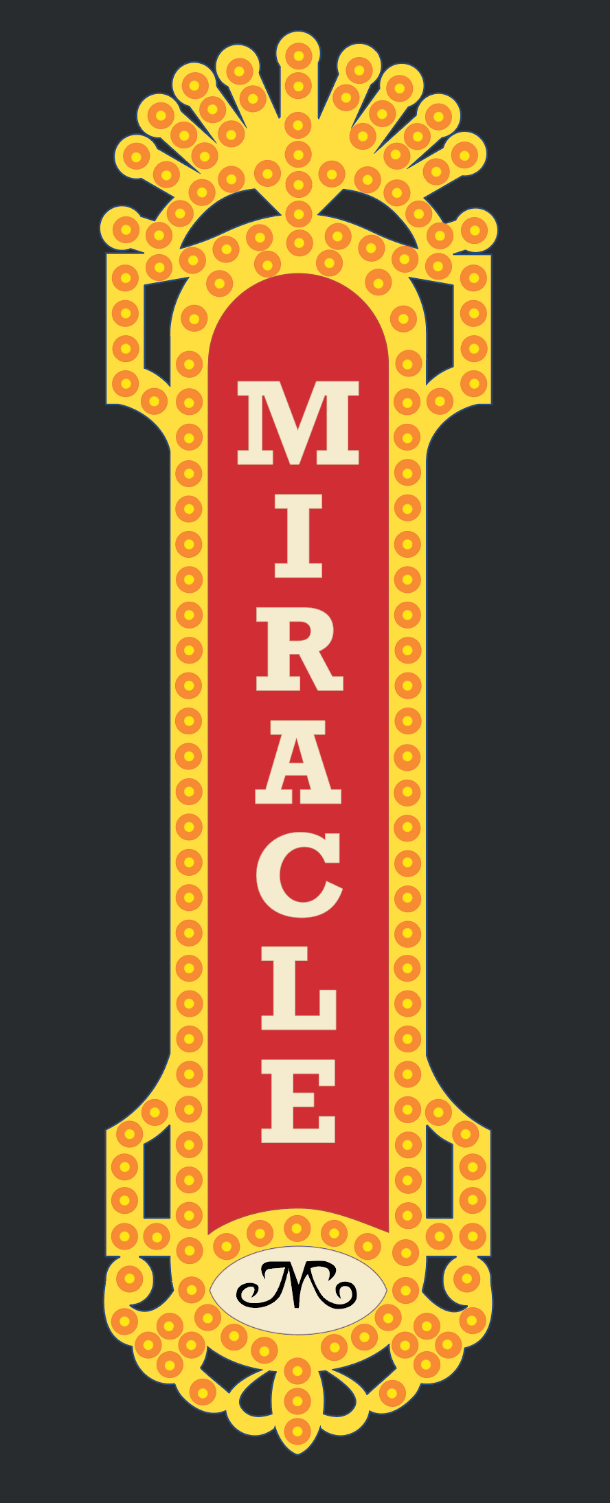
Miracle Theatre Blade Sign
Originally conceived as a physical marquee installation, this project evolved into a lightbox-based graphic system in response to production and cost constraints. The final design was developed specifically for illuminated lightbox fabrication, prioritizing clear typographic hierarchy, modular bulb structures, and a tightly controlled color palette to ensure legibility and visual impact when backlit.
Built entirely in Adobe Illustrator, the artwork was structured as a repeatable, production-ready system—using simplified forms, consistent modules, and CMYK color decisions calibrated for large-format digital output. Conceived as a scalable brand application rather than a single-use graphic, the lightbox bridges historic theatre signage with contemporary fabrication methods suited for both permanent and campaign-based installations.
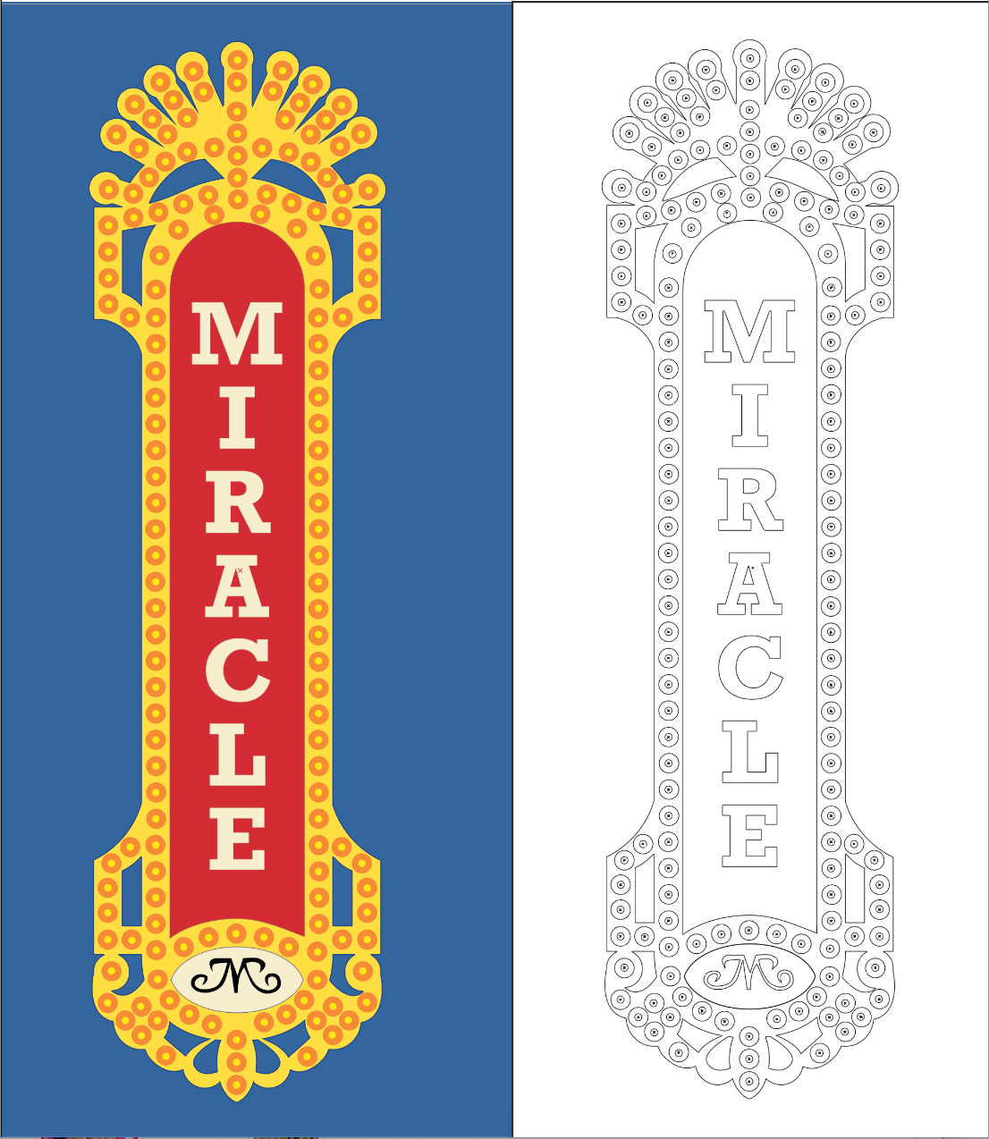
Production-ready lightbox identity system.

Original Blade Sign

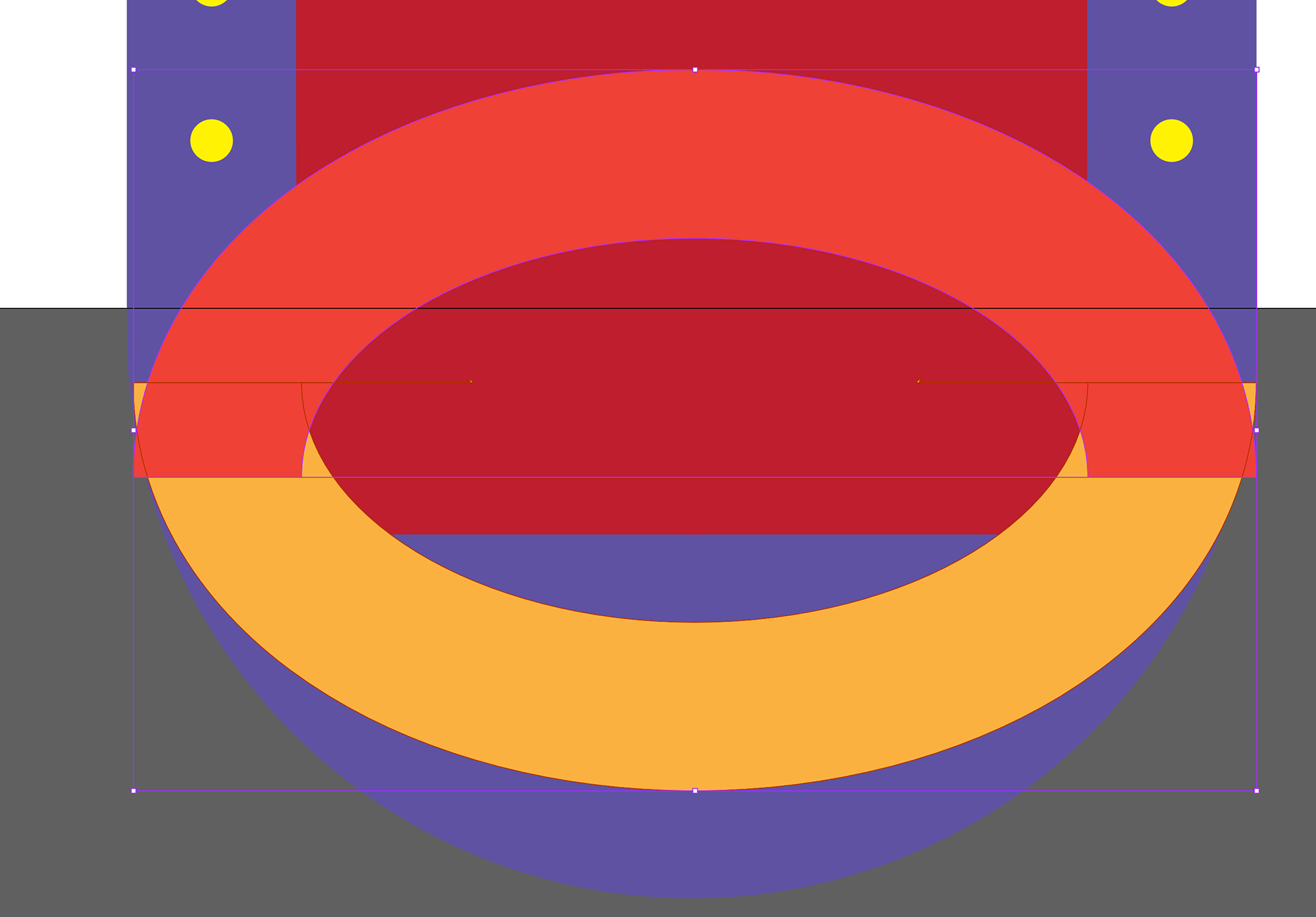
Close up -Design Workflow

Blade Sign Daytime
Design Platform
Black Background
Close up - Geometric Building
Brand Identity - Selected Works
Brand Applications - Physical
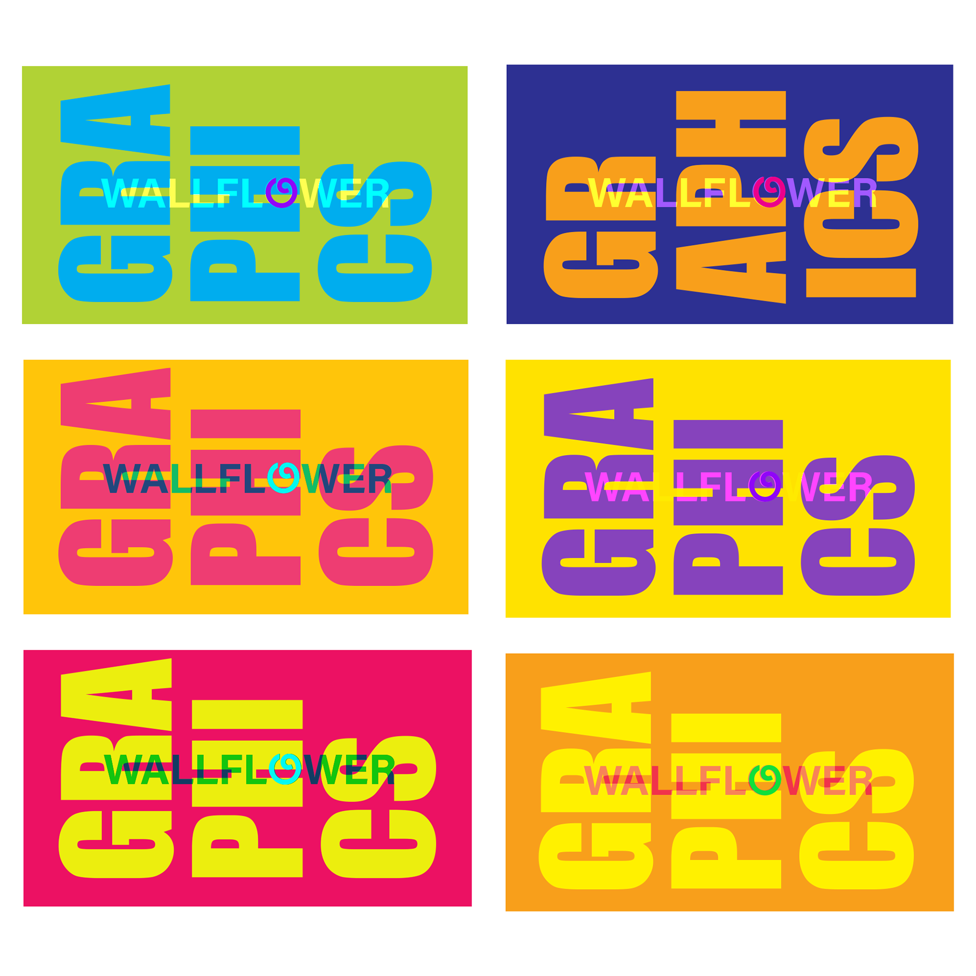
Wallflower Graphics Business Cards
The Wallflower business cards were developed as a physical brand application with a strong emphasis on layered color and typographic composition. The design explores the challenge of stacking high-chroma colors in a small format while maintaining clarity and avoiding visual muddiness—a balance achieved through deliberate color relationships, spacing, and hierarchy. Treated as a graphic field rather than a neutral container, the card uses color as a structural element of the identity system, demonstrating how expressive palettes can remain cohesive, legible, and refined in physical production..
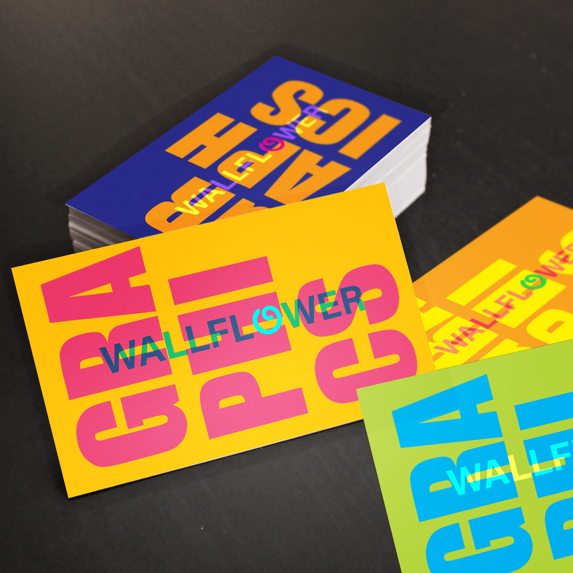
Business Cards Wallflower Graphics